
UX Case Study
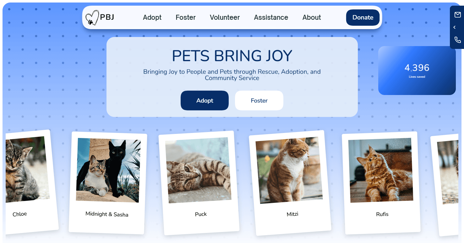
PETS BRING JOY
Website Redesign (PBJ)
↑ 18% estimated adoption application conversion
Lives saved
My Role
Design Lead · Research · Prototyping
Timeline
Six Weeks
Product
A 501(c)(3) cat rescue website serving Northern Virginia / DC metro. 4,396 animals placed since 2013. 331 adoptions in 2025.
Discover
Define
Prototype
Iterate
Outcome
INDEX
PROBLEM FRAMING
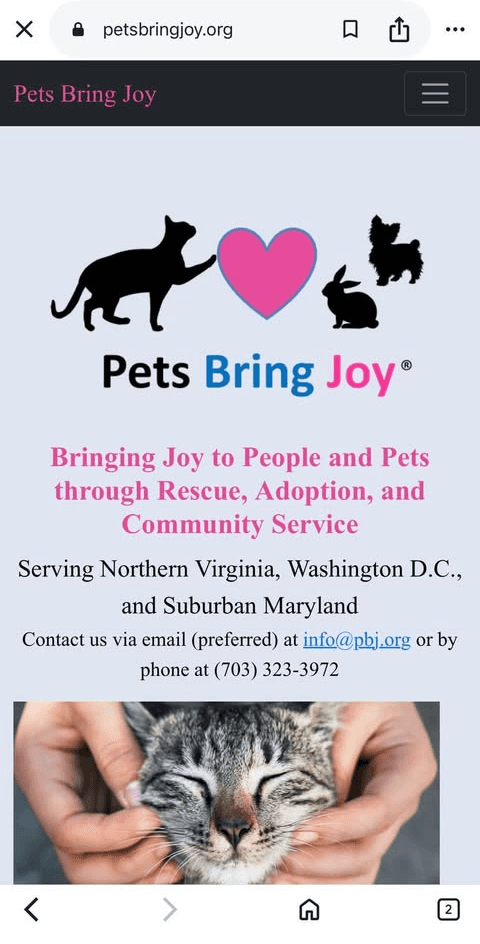
The current design creates friction with users due to slow load speeds, ambiguous users flows, and text-heavy pages. the website feel more like a brochure than a pet adoption website. As a result, users struggle to understand what to do next, where to find adoptable cats, and how the process works. This leads to high drop-offs and users seeking out other means of adoption either PBJ's social media or a different organization altogether.
The Pets Bring Joy.org website is designed like a brochure with text-heavy pages and no clear adoption funnel. It fails to deliver at the users most basic needs. Past due for an update, it's time to bring their site up date with current design principals and tech.
The organization does a great job of getting cats adopted, my goal is to transform the website into the tool that it was always meant to be and find more cats the loving homes they deserve.
Critical Problems
Slow loading speeds
Users often have to wait 5-10 seconds for pages to load.

Not mobile-friendly
Tiny/unreadable text, not touch-friendly, forms aren't optimized.

No clear adoption funnel
Users overwhelmed by options and no clear CTA above the fold.
No online donation

No Design system
Oversized images, inconsistent spacing, padding, margins

No clear mission
Impactful Solutions
Fast loading speeds
Use compressed images, lazy loading, and minimize CSS/HTML/JS.
Mobile-friendly
Flexible grid, touch-friendly CTAs, cat-first layout.
Clear adoption funnel
CTA above the fold with cat images and condensed navigation.
💳
Online donation option
Easy online payment with a variety of options.
Optimized design
Utilize a design system structured with UI design principals.
Clear mission
Mission statement and about sections moved to home page.
ROLE, SCOPE, APPROACH
This was originally a two week case study from my boot camp.
The requirements called for a full UX work up and a hi-fi mock
up of a desktop home page. I volunteered to do the UX research
so I didn't get to do much UI design.
I chose to redo the case study entirely utilizing some of the
original UX research, however I redesigned the entire site
after discovering more pain points through deeper research.
SCOPE
What I Owned
✓ Full UX audit of existing site
✓ Competitive analysis
✓ Information architecture redesign
✓ User flows and wireframes
✓ Design system
✓ High-fidelity prototype
✓ Usability testing
✓ Custom-built design in Framer
What I Didn't
• Adoption cards (PetFinder widget)
• Content writing (PBJ team provided copy)
• Photography (Unsplash/PBJ's)
• SEO implementation (handled post-handoff)
APPROACH
Audit → Research → Define → Design → Validate
PBJ's digital presence is scattered. Users feel like they are
trying to herd kittens when searching for information.
That's where the website plays a major roll as the central hub within the ecosystem. It's the "digital
kitten shepherd" keeping all the information for users together one place.
Broken Links
Facebook posts say "link in bio"
But the link goes to a text-only homepage with no cats.
Petfinder has all the cats
PBJ's site does have any with no bridge between them.
Donation links go to PayPal
No donor profiles, no recurring options shown on site.
Events announced on Facebook
No calendar on the website.
Unified Vision
Cat Gallery
Petfinder data
+
Live PBJ site
PBJ Application
Inline form with Google Docs
Donation Hub
Recurring tiers
+
impact stats
Events
Calendar
+
RSVP on site
Everything in one central location with no confusion for users


DEFINE
Research | Define | Direction
RESEARCH
Methods used: Heuristic evaluation, survey, analytics review
Heuristic Evaluation

Logo
Not needed
& too large
Image not
above the
fold

Survey
What was the most frustrating or confusing part of the adoption process?
How likely would you recommend Pets Bring Joy to a family member, friend, or colleague? (Likert scale from “very unlikely” to “very likely”)
On a scale from 1–10, how would you rate the visual design and layout of the PBJ website?
How would you describe the process of adopting from PBJ? (Likert scale from “not easy at all” to “very easy”)
Survey Questions
What was the most frustrating or confusing part of the adoption process?
How likely would you recommend Pets Bring Joy to a family member, friend, or colleague? (Likert scale from “very unlikely” to “very likely”)
On a scale from 1–10, how would you rate the visual design and layout of the PBJ website?
How would you describe the process of adopting from PBJ? (Likert scale from “not easy at all” to “very easy”)
Analytics Review
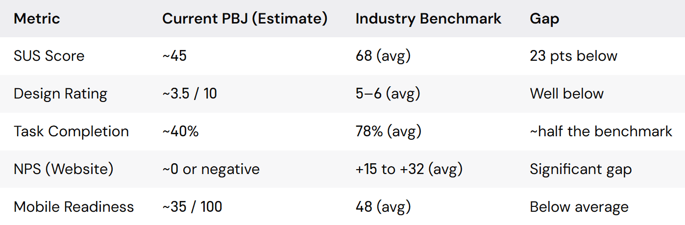
Plugging in the answers from the survey into a scoring table allows us to take the redesign from a subjective "make it better" into a data-driven "close these specific gaps" answer key.
If the redesign moves SUS to 68+, task completion to 80%+, and mobile readiness to 80+, we've quantifiably fixed user pain points and can continuously track this data in the future.
These are all speculative numbers because I don't have access to the actual analytics on the current site, however this is good practice for implementing the data we do have into desirable quantifiable data.
SUS Score (System Usability Scale) NPS (Net Promoter Score)
User Needs
"I want to see cats before I apply"
"I want to see where my donation goes"
"I want a faster response after I apply"
"I want to an easier way to donate"
Problem Statements
PBJ's current site underperforms across every measurable aspect, but the most critical gap is task completion.
Only ~40%(estimated) of users can successfully find and apply for a cat, compared to a 78% industry average. That's not a visual problem, it's a critical failure. The site is actively losing more than half its potential adopters before they ever see a cat.
The SUS score (~45) puts the site in the "low usability" range. Users find it frustrating, not just dated . And the near-zero or negative NPS suggests the digital experience is hurting PBJ's reputation, even though the rescue itself does excellent work.
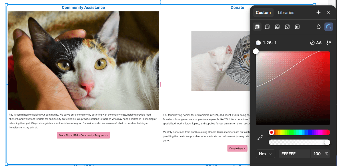
UX DESIGN
Before
After
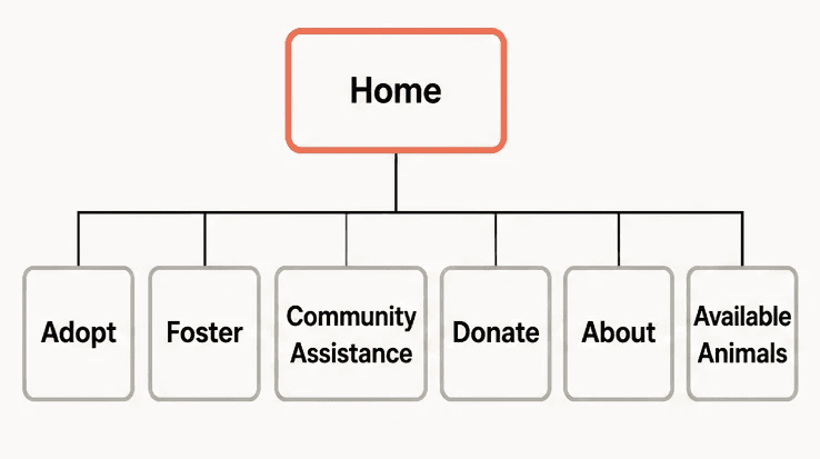
Home
Donate + Contact + Adoptable cats + Events + Stats + CTA + Sponsors
Adopt
Browse cats
Adoption Process
Adoption Application
Foster
Foster
Process
Foster Appplication
About
Mission & Team
Success Stories
Impact
Stats & Reports
Assistance
Lost & Found
Volunteer
Rehome/
help of any kind
Donate
One-Time
+
Monthly/Yearly Tiers
Other Ways to Give
Critical Problems
Impactful Solutions
Fast loading speeds
Mobile-friendly
Clear adoption funnel
💳
Online donation option
Optimized design
Clear mission
ROLE, SCOPE, APPROACH
This was originally a two week case study from my boot camp.
The requirements called for a full UX work up and a hi-fi mock
up of a desktop home page. I volunteered to do the UX research
so I didn't get to do much UI design.
I chose to redo the case study entirely utilizing some of the
original UX research, however I redesigned the entire site
after discovering more pain points through deeper research.
SCOPE
What I Owned
✓ Full UX audit of existing site
✓ Competitive analysis
✓ Information architecture redesign
✓ User flows and wireframes
✓ Design system
✓ High-fidelity prototype
✓ Usability testing
✓ Custom-built design in Framer
What I Didn't
• Adoption cards (PetFinder)
• Content writing (PBJ )
• Photography (Unsplash/PBJ)
• SEO implementation (post-handoff)
APPROACH
Audit → Research → Define → Design → Validate
PBJ's digital presence is scattered. Users feel like they are
trying to herd kittens when searching for information.
That's where the website plays a major roll as the central hub within the ecosystem. It's the "digital
kitten shepherd" keeping all the information for users together one place.
Broken Links
Facebook posts say "link in bio"
But the link goes to a text-only homepage with no cats.
Petfinder has all the cats
PBJ's site does have any with no bridge between them.
Donation links go to PayPal
No donor profiles, no recurring options shown on site.
Events announced on Facebook
No calendar on the website.
Unified Vision
Cat Gallery
Petfinder data
+
Live PBJ site
PBJ Application
Inline form with Google Docs
Donation Hub
Recurring tiers
+
impact stats
Events
Calendar
+
RSVP on site